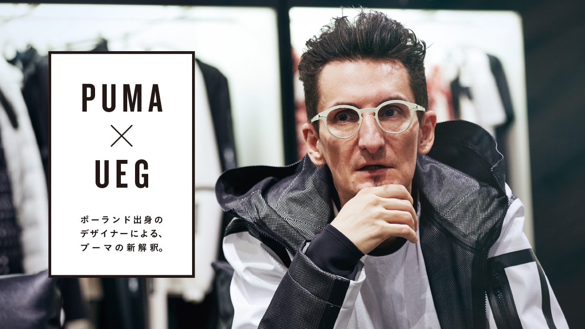
A new interpretation of Puma , by a Polish designer.
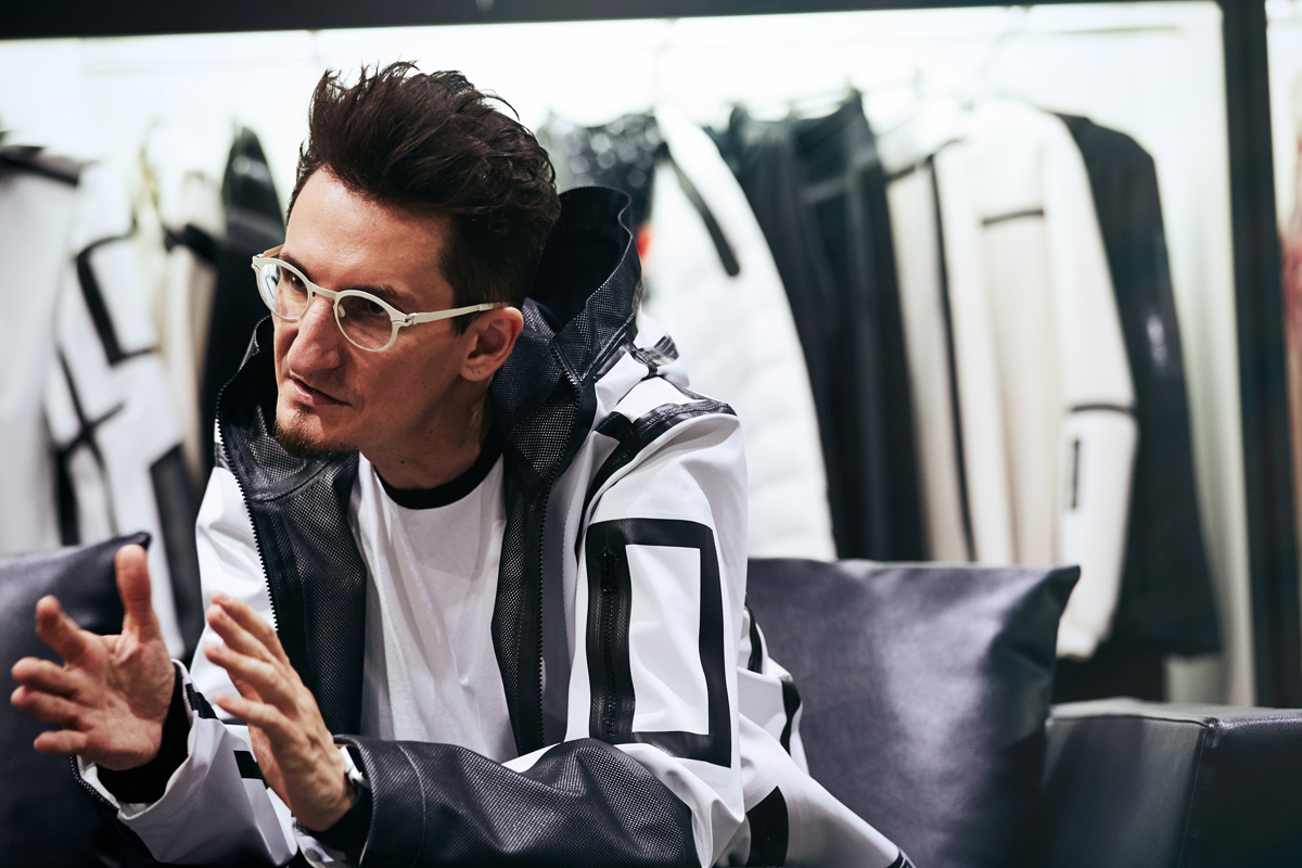
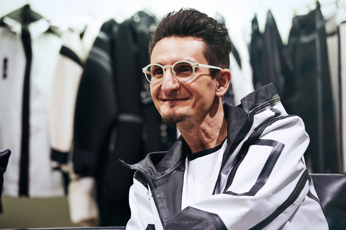
In recent years, PUMA has been actively collaborating with a variety of brands and has been increasing its presence in the fashion scene. This season, PUMA has released its first collaboration collection with UEG, a brand from Warsaw, Poland. However, there must be many people who have never heard of the brand "UEG" before. We asked the brand's designer, Michał Wojewski, about the collaboration and his own background.
. Born in 1974. After spending his childhood in Tokyo, he returned to his native Poland. After graduating from the Faculty of Graphic Arts at the Warsaw University of the Arts, he started "UEG" in 2004.
UEG (U.E.G.)
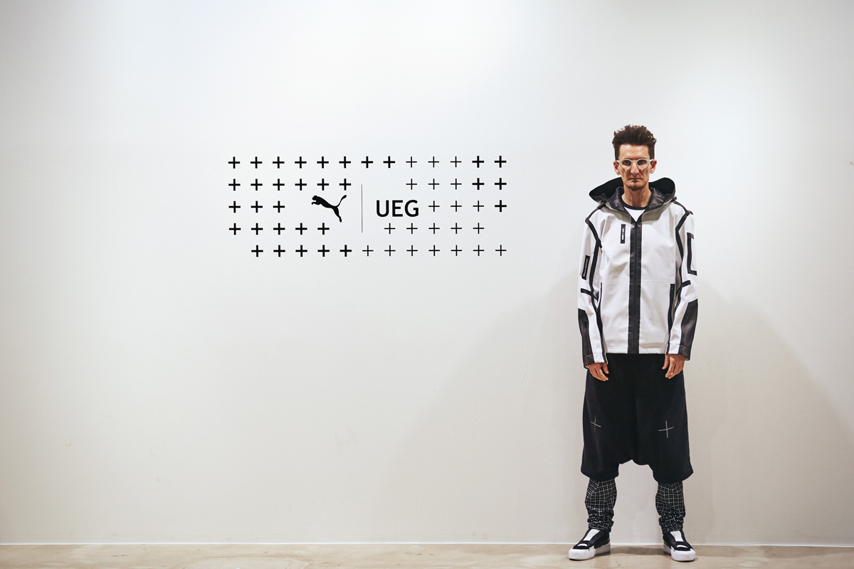
Launched in 2004 as an art project by Michał Wojewski, the brand was relaunched in 2012 as a fashion brand mixing art and street. The brand name "UEG" is derived from the first letter of the Italian phrase "use and discard," and cynically expresses today's consumer society.
. a philosophical approach, going deep into the concept.
-How did this collaboration start?
It all started when my friend Kaya happened to meet Yaseen, the director of Puma Select (*Puma's collaboration line), in Hong Kong. Yaseen was interested in "UEG" and gave me a call. A week later, he flew from Herzogenaurach, Germany (where Puma's headquarters is located) to Warsaw, Poland, where I live. We talked a lot about each other, and we decided to do something together, which led to this collaboration.
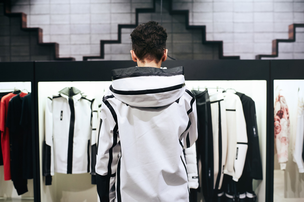
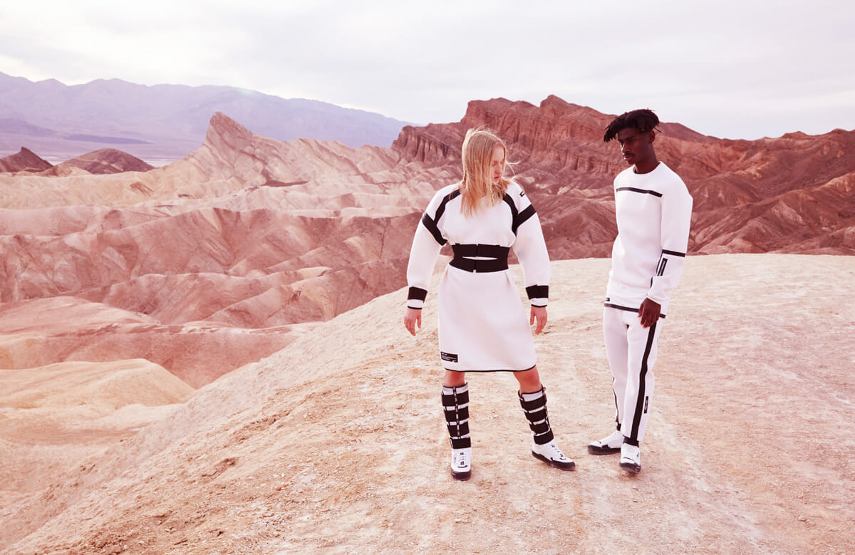
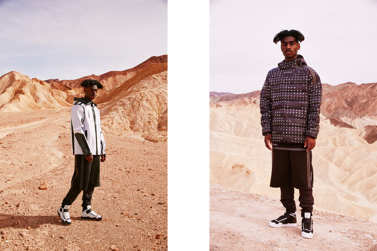
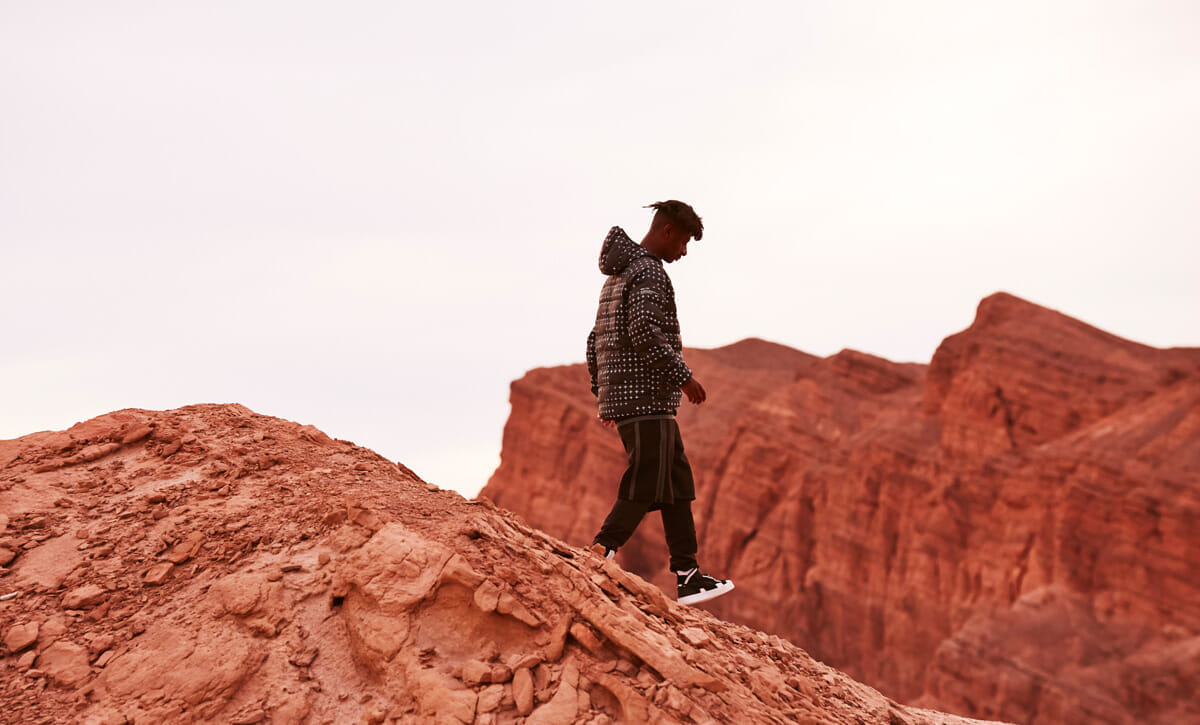
-Can you tell us more about the theme of your collection, "GRAVITY RESISTANCE"?
At our first meeting, the keyword presented by Yasin of PUMA was simple: "basketball. How could we pursue the concept of the collection while adding our own personal touch, without departing from it? It is something that UEG has always done, and this collaboration was no different.
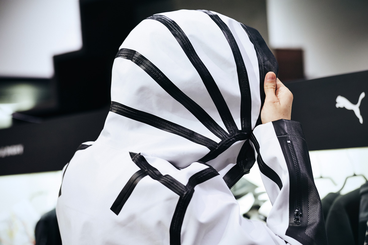
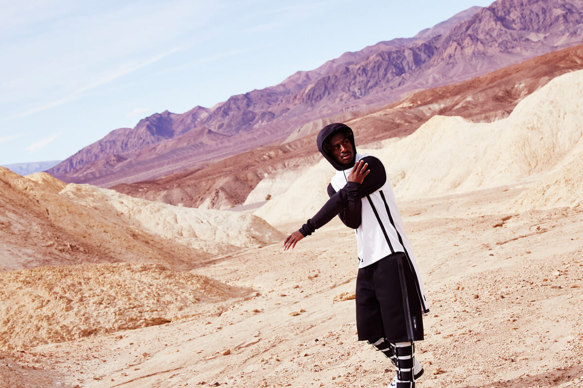
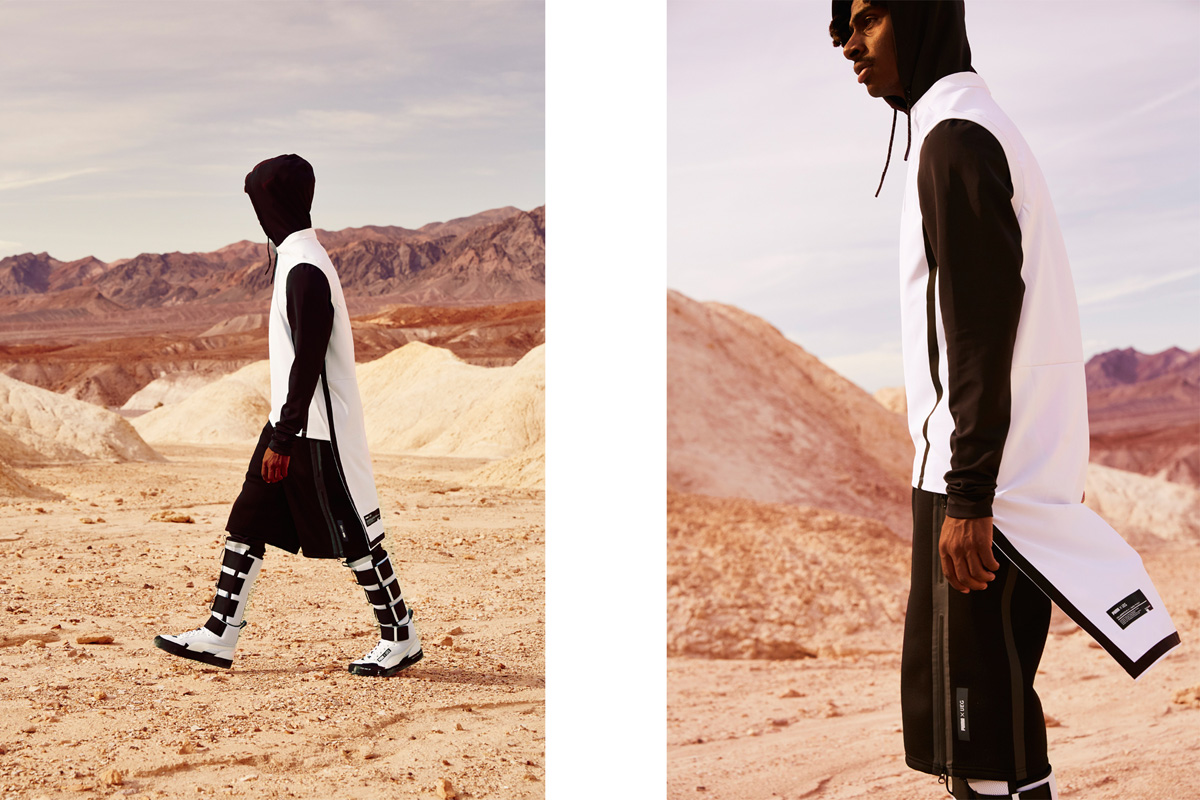
This time, in the process of going deeper into what is hidden in the sport of basketball, we tried to take a more philosophical approach. Basketball is a sport in which people are suspended in the air, right? People challenge their limits and fight against gravity in the pursuit of height. This is where the keywords "beyond the limits" came to mind, which led to the keywords "spacesuit" and "spaceship, This led us to the concept of "GRAVITY RESISTANCE.
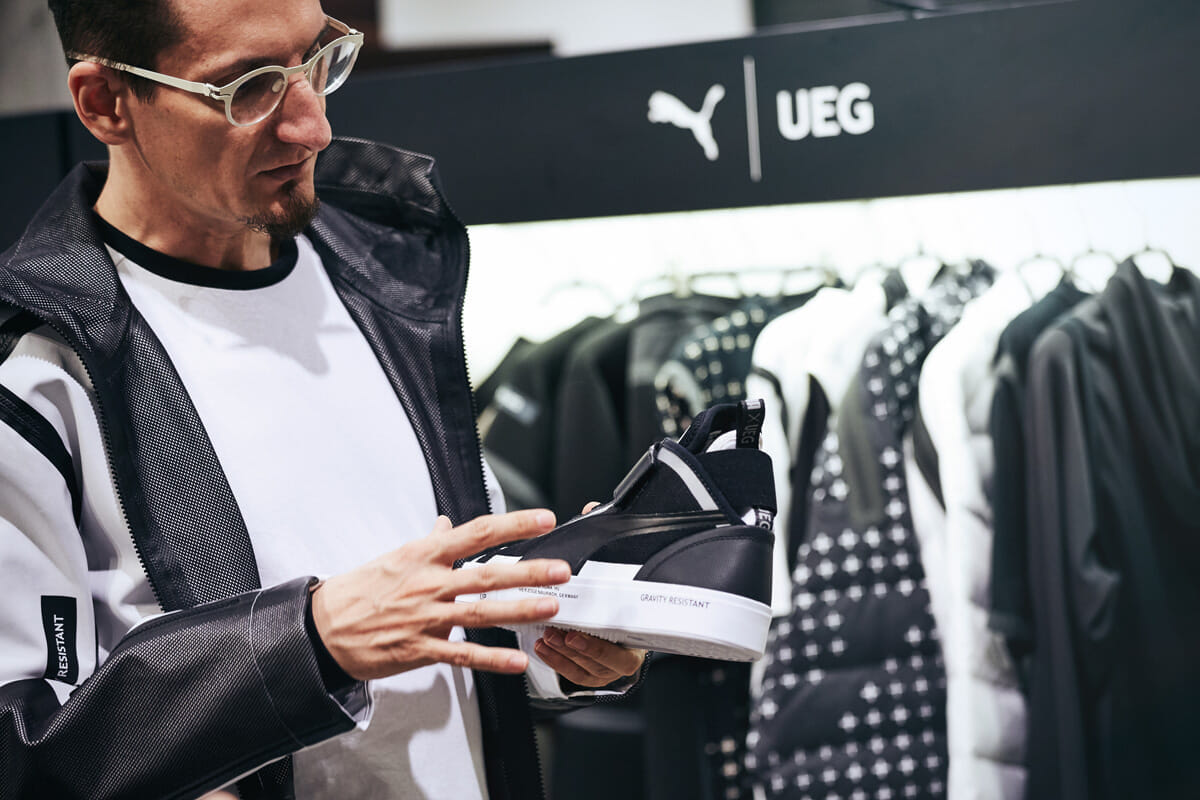
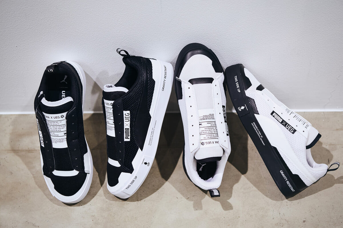
The sole is made to the "perfect thickness for me".
-Which are the key items in this collection? . and tell us more about it?
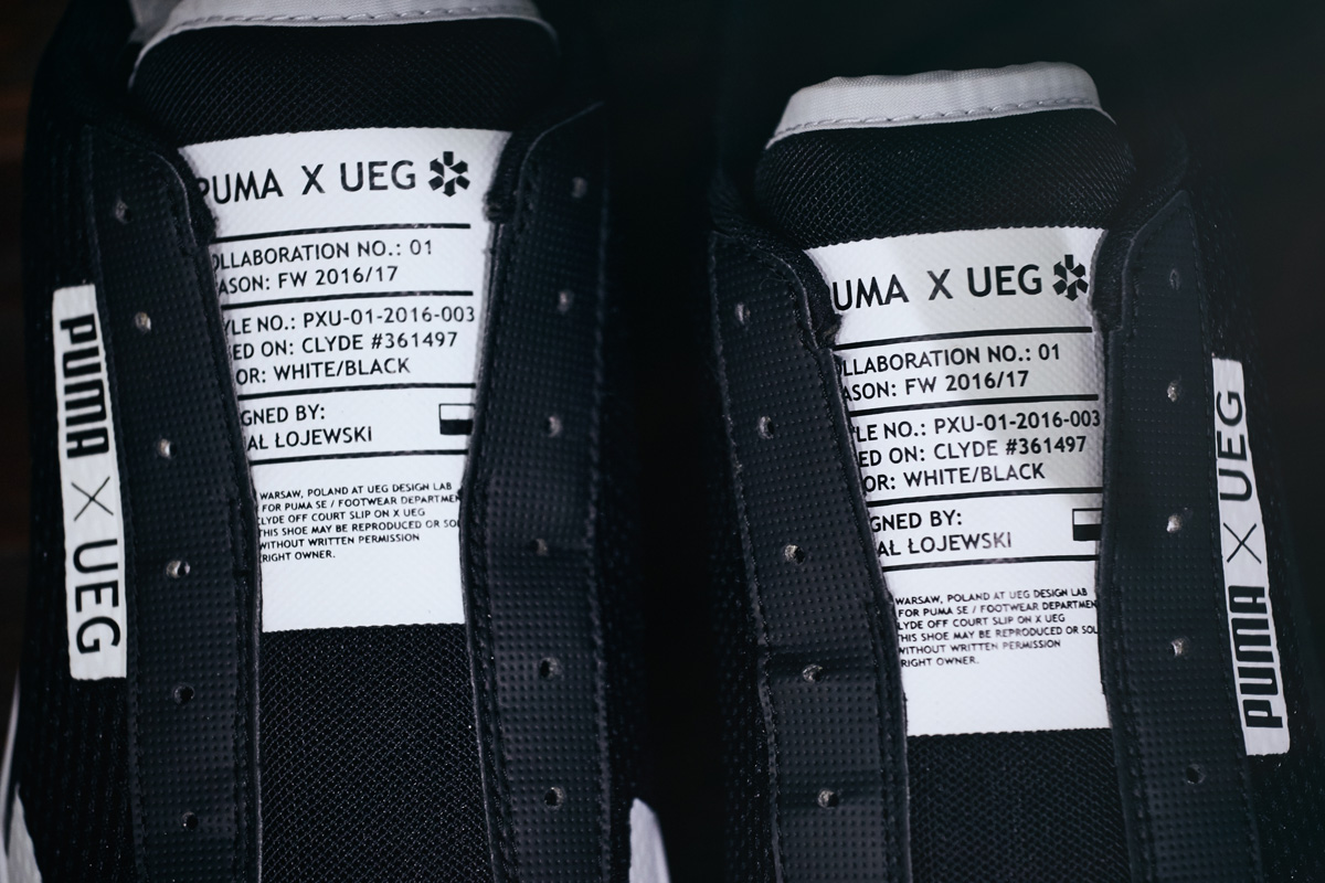
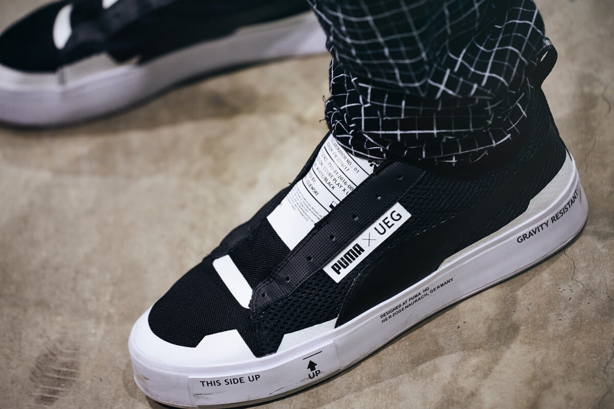
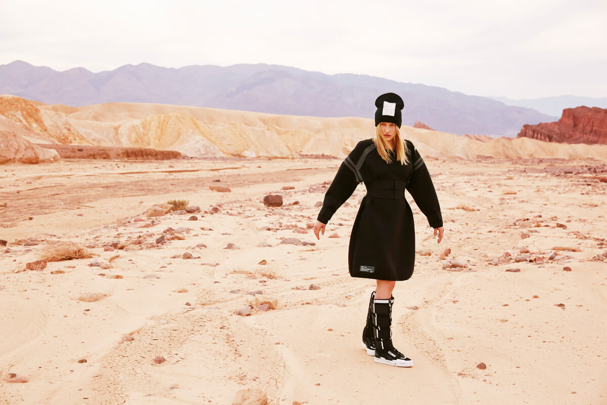
. Of particular importance is the footwear. The sole was specially made for this collection, and I was very particular about its thickness. The soles are a little thicker than those of regular Puma shoes, but for me, this is the perfect thickness.
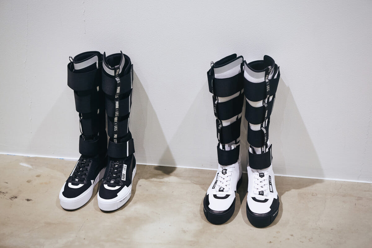
My personal favorite footwear is a boot type based on the "Sky High," which I bought when I came to Japan about four or five years ago, and I really liked it, so I used it as a motif and gave it a UEG twist by using Velcro, reflective material, and synthetic leather. I added some UEG touches, such as using Velcro, reflective material, and synthetic leather.
What is the meaning behind the typography?
. -I've seen typography in many places, both in footwear and apparel.
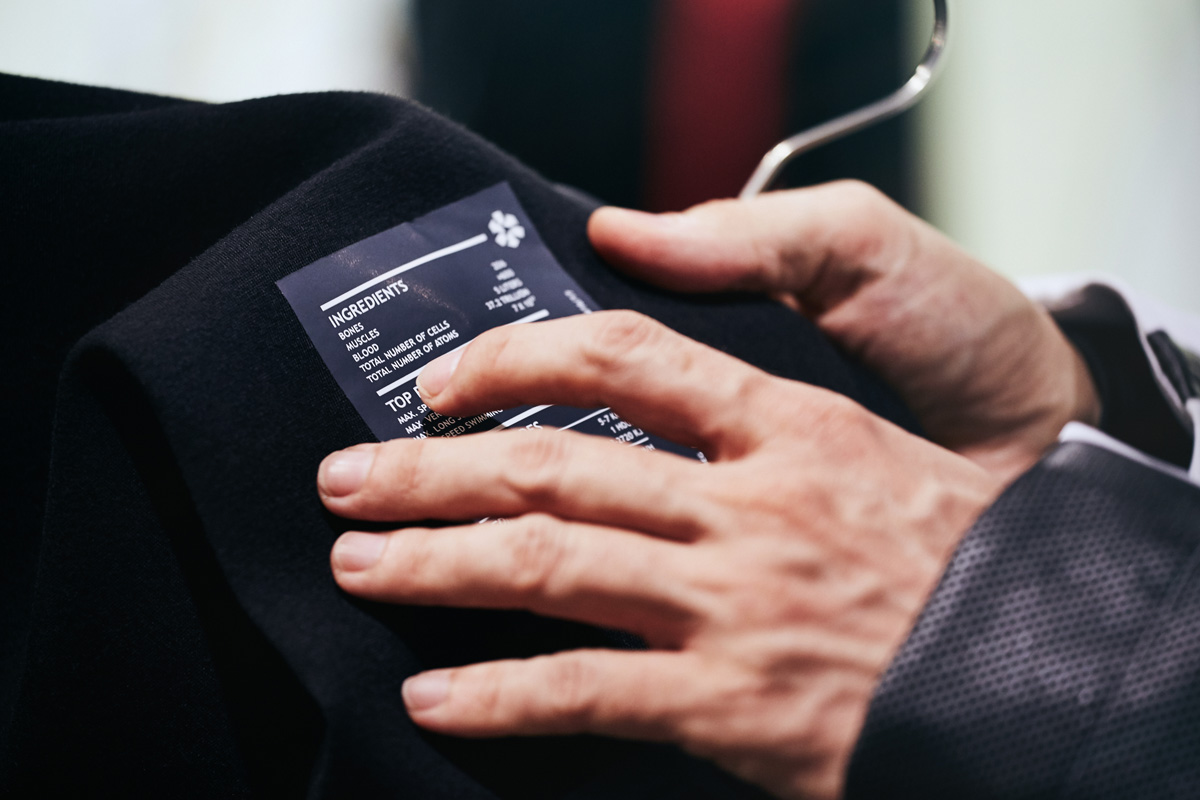
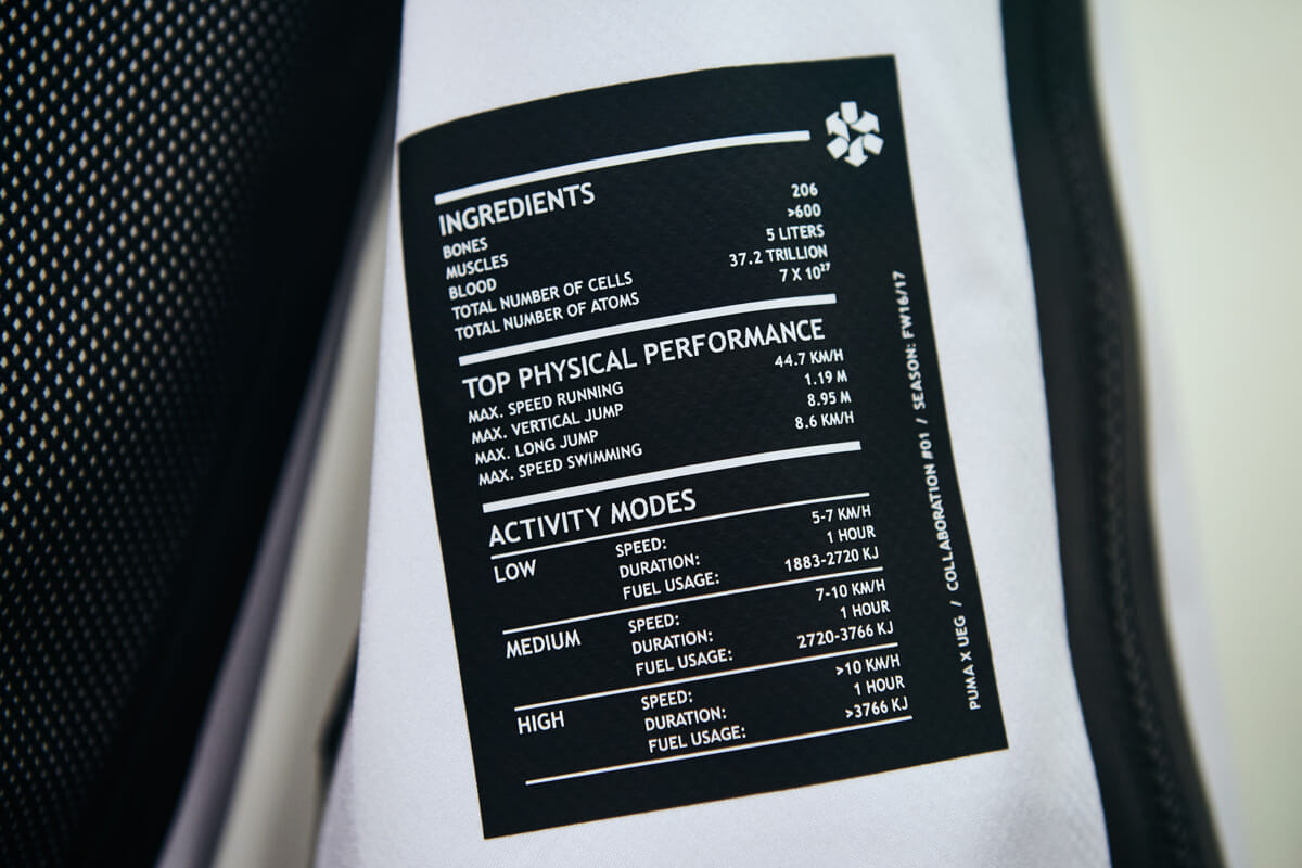
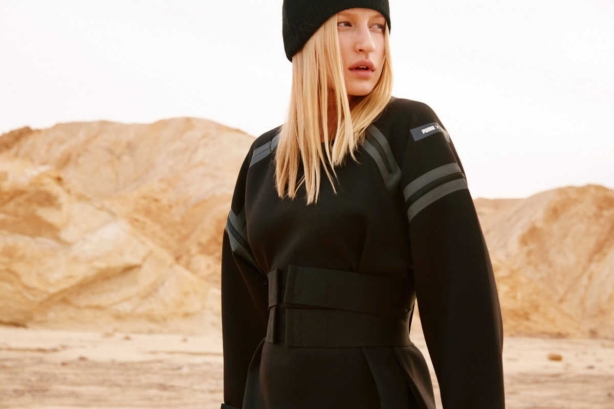
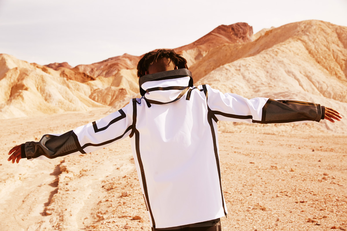
I am a graphic designer by trade , and typography is a technique I use frequently at UEG. All typography has meaning. In space, there is no sound, so writing is an important means of communication. In this collection, typography is used to express notes about collaboration, human "raw materials" such as bones, muscles, and blood, and the limits of human physical performance.
. - The foam stripes on the footwear are thermo-compression treated, watertight zips are used on the garments, and other details can be glimpsed.
Yes, it is. . We designed the building not only for its design, but also for its functionality to make urban living comfortable.
There is also "freedom not to use color.
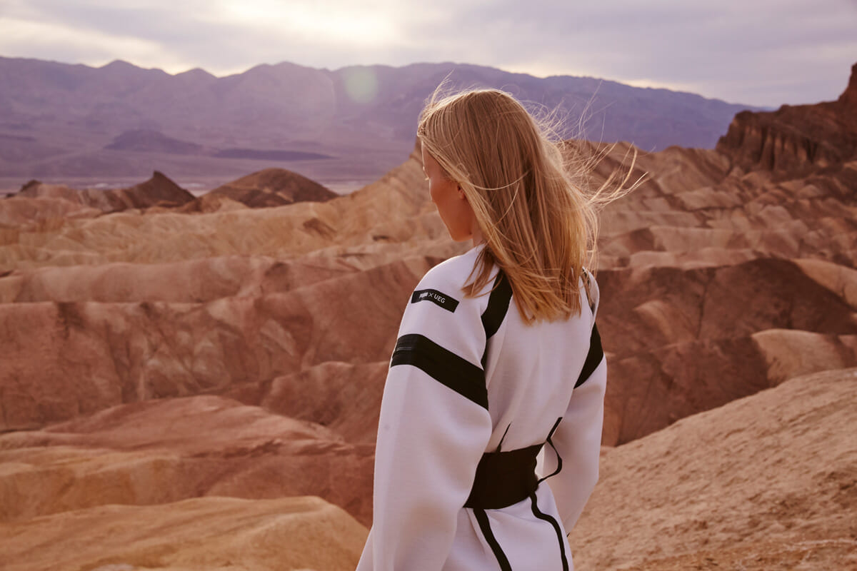
-The collection is all black and white and monotone, why did you make it that way?
I see fashion as a medium for communicating ideas. Is color absolutely necessary to communicate an idea to someone? I do not think it is necessarily necessary. You can use any combination of colors. The choices are endless. But there is also "freedom not to use color".
This is a bit of a digression, but I also work in corporate branding. In branding, color has a very strong message. Therefore, we have to be very careful when using color.
-Puma is a sports brand, a sneaker brand, and a fashion brand. ...... It is such a multifaceted brand, but what kind of image does Puma have for you, Michaud? What kind of image do you have of PUMA?
As you say, Puma is originally a sports brand, but I think there is no small part of it that is rooted in the street. Especially in recent years, I have the strong impression that they are moving toward fashion.
-How do you feel about your first collaboration with PUMA?
. We were allowed to design freely without any restrictions, and we are very happy about that. What was also great about collaborating with a sports brand like Puma was that we were able to use materials with the latest technology cultivated in the world of sports. This is something my own brand could not do. I think the comfort of the footwear in particular is wonderful, and I hope that Japanese fans will enjoy them as well.