What we aimed for was a good, not-too-fashionable quality that is unique to outdoor brands.
What requests did Kaneko-san give you regarding art direction?
Kaneko: I told them that I wanted to focus on "tools" as objects, showing them archived materials from the Outdoor Products archives as I went along (laughs). I was confident that I could make a good product, but I was more concerned than usual about the art direction in terms of presenting it properly. Even now, people don't go out on the street that much because of the Corona disaster, and I think the impression you get when you look at a product through a smartphone display is very important. The same is true not only for bags but also for clothes. It is not the time to simply make good products, but I think it is necessary to think about how to put graphics on them from the viewpoint of art direction.

Q: Mr. Hirabayashi, how did you interpret the keyword "tool" as you proceeded through the design process?
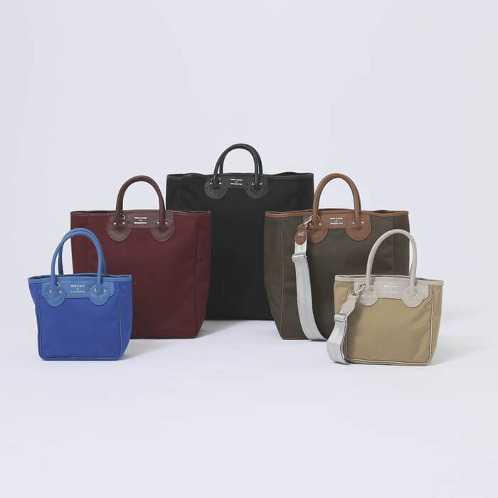
Hirabayashi: I was conscious of creating a tool-like mood, not a fashionable bag shop, but a tool shop. As Mr. Kaneko mentioned in his presentation material, there is a kind of "not-too-fashionable" quality that is unique to outdoor brands. Personally, I wanted the bag to have a look that would not be out of place with high-brand clothes, so I thought about where to place the bag.
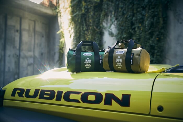
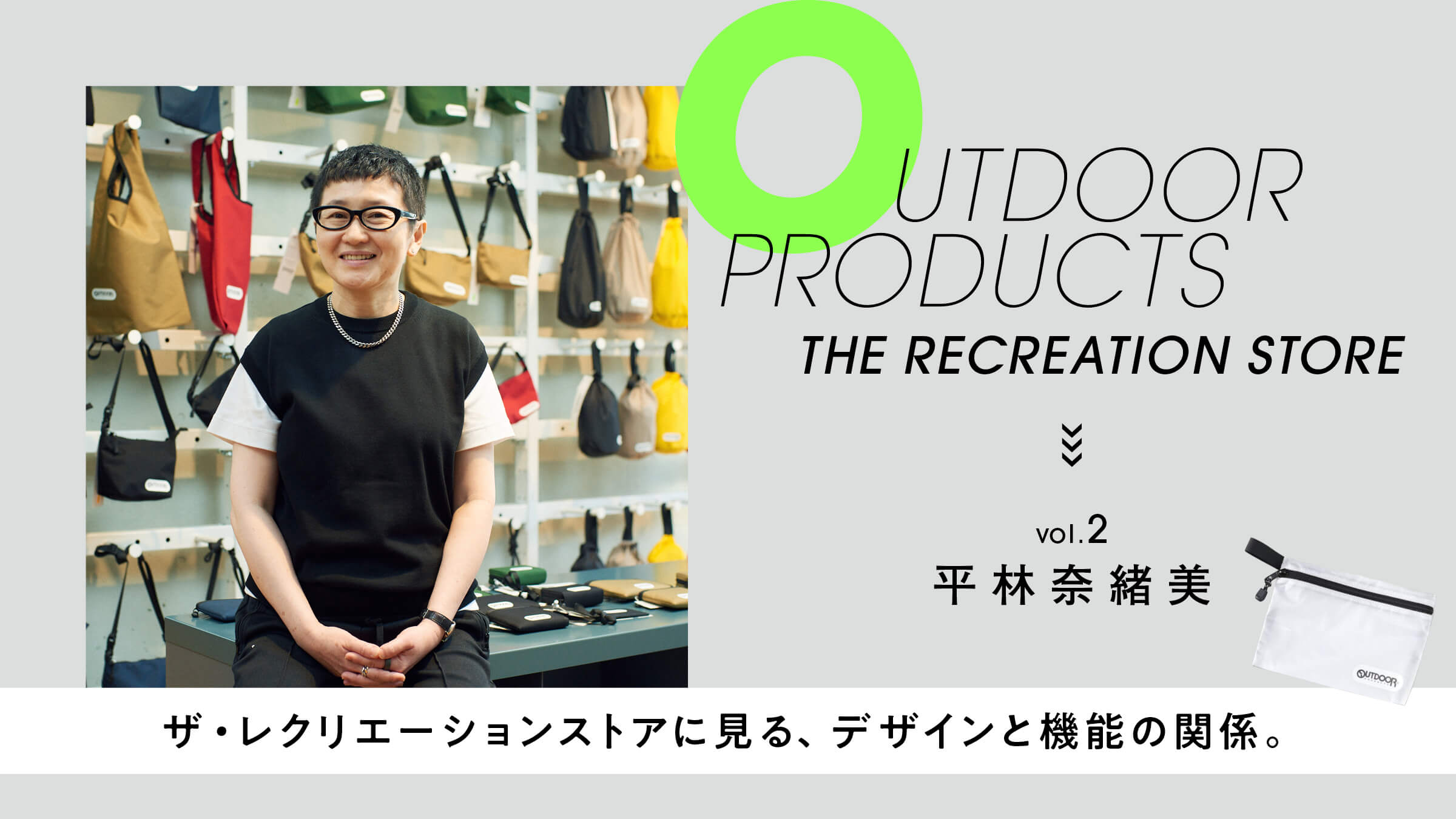
Kaneko: There is a standard bag called a "rolled Boston," and there is a promotional tool called a "duffel tower" that stacks these bags according to size. Using that as a starting point, I reviewed it from scratch and worked out what to include.
When we look at the actual typography printed on the logos and bags of the stores that you have worked on, the overall typeface is bold, but the shape is elongated.
Kaneko: For the logo, Mr. Hirabayashi proposed two versions, one with all capital letters and the other with a capital head. At first, we thought the former was easier to understand and looked better. We had never seen the latter one before, and it felt strange to us, but Mr. Hirabayashi said that the latter one was what he was in the mood for. I believed that if Mr. Hirabayashi was personally interested in it, it must be a step forward, so I decided on the version with capital letters for my current head. At what point did you decide that this version might be better?
Hirabayashi: I can't really explain it in words, but when I make a logo, I'm pretty particular about things like making it all lower case, with only the first letter capitalized, and so on, since the name and the letters have a great deal to do with each other. Actually, I thought it would have been more neatly assembled with only uppercase letters. But as I think about the logo, I also try to develop it into bags and tags, and when I check it in various sizes, my feelings often change from the first time. If this was to be used only in A3 size, it might have been a capital letter.
Kaneko: The exclusive models at The Recreation Store have the liters of capacity and size printed on the front of the bag, and it was great to see the Outdoor Products tag line "PACK FOR LIFE It was great that they added "PACK FOR LIFE," which is the tag line of "Outdoor Products.